
 It
could be useful to have an approximate estimate of the time required to complete
each topic. Such estimates could be provided by "time icons" available
in the topic rollovers. (Each icon gives the estimated time as a multiple of
5 min., say.)
 Milena Droumeva suggests including a visual representation
of reset or redone assessments in the interface. The bordered cone pictured
is one possibility, representing a red cone reset to black. However, on reflection,
it seems likely that such a representation would prove to be de-motivating:
the "turn it all green as I go along" student of the Feedback section
would probably not want to be reminded directly of the red and yellow cones
she worked so hard to replace with green ones. The information should probably
be available somewhere, but perhaps as a menu choice or preference setting,
or as part of the cone's rollover information.
Milena Droumeva suggests including a visual representation
of reset or redone assessments in the interface. The bordered cone pictured
is one possibility, representing a red cone reset to black. However, on reflection,
it seems likely that such a representation would prove to be de-motivating:
the "turn it all green as I go along" student of the Feedback section
would probably not want to be reminded directly of the red and yellow cones
she worked so hard to replace with green ones. The information should probably
be available somewhere, but perhaps as a menu choice or preference setting,
or as part of the cone's rollover information.With well written introductory materials under the module and lesson nodes, three possible levels of understanding may be possible for the same course, and not all need be completed to have a meaningful learning experience.
The course content materials for this interface were initially assumed to consist of Flash movies, which means that they themselves can contain many levels of interactivity or none at all. However, it is not difficult to re-program Flash buttons, etc. to control web page navigation, so this interface could also be adapted to web-based course materials, containing anything that can live on an HTML page.
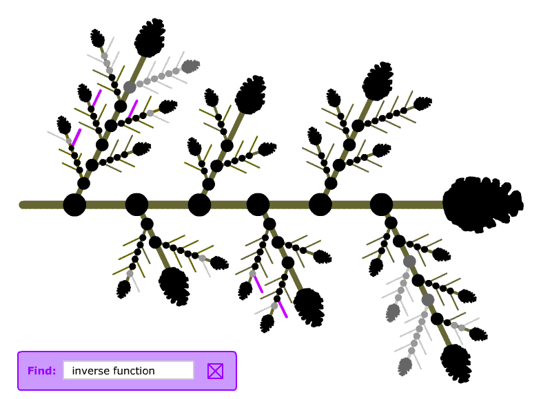
This interface is potentially highly programmable. Though the demo interface in the Navigation section was largely "hacked" from Flash drawings with some interactivity attached, the structure of the interface is mostly repetitions of a basic unit of node, branch and terminator (cone). With appropriate parameters for node radius, branch length and thickness, terminator shape and size, node separation, angle made with the next larger branch, colour choices and so on, these basic units could easily be drawn and assembled programmatically, in multiple, visual branch-like forms. With an appropriate file structure for the content (possibly including XML files, which Flash can handle), it would be straightforward to attach the interface to the content as in the demo. Potentially, then, we could build a highly flexible tool for producing course interfaces like the calculus one.
|
||||||
| Introduction | Structure | Navigation | Feedback | Et cetera | ||