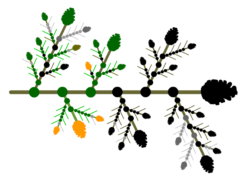
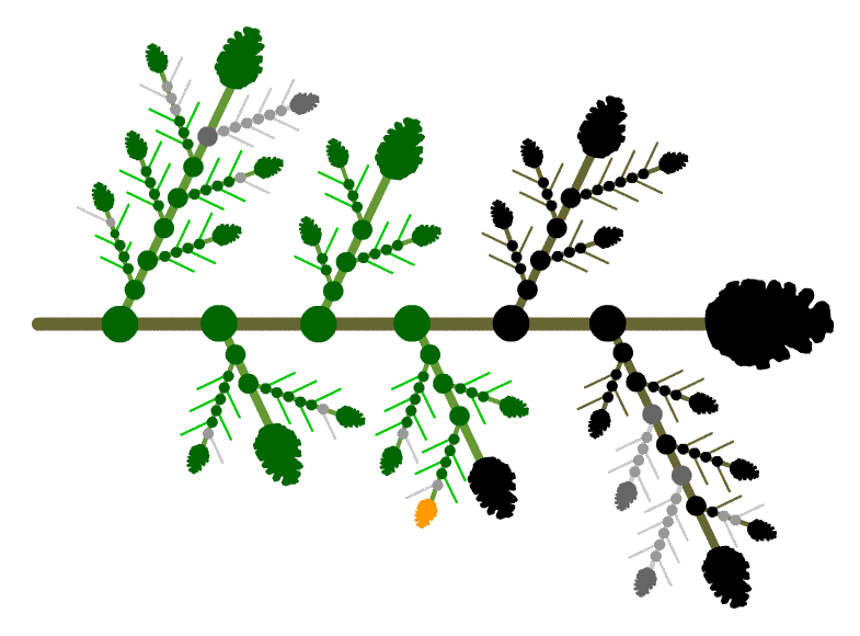
The main form of feedback for this interface is colour, both to indicate
completed work and to indicate the status of assessments.
As was illustrated in the earlier demo, shades of green are used to indicate
the student's progress through the material:
- Each node turns green when clicked (or back to black when reset).
- Each branch turns green whenever all its material (excluding assessments)
has been completed.
- Each topic needle turns green when the student decides he has completed
the topic (or turns back to brown when reset).
There is a natural metaphor behind this colour choice: the original fir-branch
is a wintry black and brown, and turns green as the student's knowledge "grows" throughout
the course.
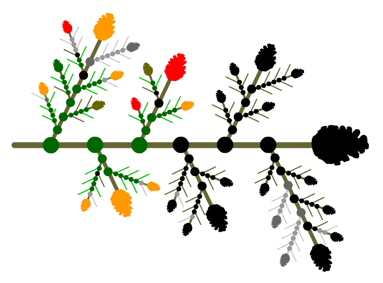
To show the student his assessment record, cone colours are used. In addition
to the black cones (representing an unviewed assignment) and brown cones
(representing an assessment viewed but not attempted), we have "traffic
light" cones:
 |
Good performance; proceed directly to subsequent material |
 |
Borderline performance; proceed to subsequent material only with caution |
 |
Inadequate performance; do not attempt subsequent material without
substantial revision and reassessment of the present material. |
These colours have a familiar "go, caution, stop" significance
which meshes appropriately with the "foliage" of the branch: green
cones blend in with green nodes, branches and needles and don't elicit attention;
red and yellow cones pop out pre-attentively and do elicit attention.
This colour code is not yet implemented in the
interface, but works as follows. Each cone changes to the appropriate colour
once the student completes the corresponding assessment, but he always has
the option to reset the colour "downward". For example, in addition
to an option to redo the assessment (with different questions), a student with
a borderline assessment (yellow cone) has the option to reset the cone colour
to black (unattempted), or to red (inadequate) if he feels that reflects his
actual understanding of the material and wants a visual flag for future review,
say.
For concreteness, here are a few use scenarios,
for hypothetical students part-way through the course.
This student has "already done all this stuff
in high-school" and is impatient. He's skipped parts of the course he
feels he already knows, but starts to run into trouble in Module 2. Fortunately,
he then realizes he needs to be more careful and thorough, and starts to
work harder. He doesn't redo parts of the course he's weak on, but intends
to use the red and yellow cones as flags for what needs to be reviewed later.

This student works very hard, and always makes
sure she understands each part of the course before proceeding to the next.
She's gotten borderline or failing assessments several times already, but
revised and reassessed her learning immediately until she got the cone to
turn green. Her strategy is "turn it all green as I go along".
She's about to review Lesson 4.3.

This student is badly prepared for this
course and has bad study habits. He doesn't revise assessments he hasn't
done well in, and soon runs into serious trouble when what he's learning
depends heavily on previous material. His fir branch looks like a colourful
Christmas tree, and once he looks at it seriously, he'll probably realize
he's unlikely to learn much from this course, and will give up.

To summarize: this interface provides the student
with visual information on
- his progress through the course material (through nodes and branches
that turn green)
- his assessments for each part of his learning (through cones that turn
green, yellow or red).
Both forms of information are resetable


